COMPETITION : New ScoobyNet Logo


 07 November 2006, 06:13 PM
#34
Scooby Regular
iTrader: (5)

Join Date: Jan 2004
Location: Bedfordshire
Posts: 8,948
Likes: 0
Received 0 Likes
on
0 Posts
Thanks Weby 
I'll have a think about that idea of yours...
Btw, NASIOC.com did this very same this not too long ago, have a look at there new logo, which has a glass globe with the subaru stars incorporated into it.

This comp is deffo hotting up
Darren
I'll have a think about that idea of yours...
Btw, NASIOC.com did this very same this not too long ago, have a look at there new logo, which has a glass globe with the subaru stars incorporated into it.
This comp is deffo hotting up
Darren
Originally Posted by webmaster
Nice work Darren!
Thanks for putting in the time you've obviously spent on them!
I don't think it would be right (or legal I suspect) to use the Subaru logo as part of the new ScoobyNet logo. But I like the direction you're going in. What do you think to incorporating something that shows its a community, like a speech bubble or similar? Thanks again!
Thanks also to isubaru. Great looking logo, but it would make the wording very small if you wanted to fit it on to a small area of the screen, and the faded, non-solid colour make it more difficult to use for print. It looks seriously cool though!
Keep them coming guys, I feel more confident now that we're doing the right thing!
Last edited by SC008Y_MAD; 07 November 2006 at 06:27 PM.


 07 November 2006, 08:12 PM
#36
Scooby Regular
iTrader: (5)
Join Date: Jan 2004
Location: Bedfordshire
Posts: 8,948
Likes: 0
Received 0 Likes
on
0 Posts
Not bad. Nice Idea, but I might look a little tacky if it was resized.
I think, what we need to design is a say a 3d logo and a 2d variant of it to make stickers and to print on to clothing etc...
Darren
I think, what we need to design is a say a 3d logo and a 2d variant of it to make stickers and to print on to clothing etc...
Darren
07 November 2006, 10:03 PM
#37
Originally Posted by webmaster
We'll set an initial closing date of this friday, and will review it based on the entries we've had then.
 07 November 2006, 10:09 PM
#38
Scooby Regular

Originally Posted by scoobywrxuk300
I think it might be a decent gesture, if you included some kind of tribute to Richard Burns, If Subaru wont pay a new tribute to him, perhaps we could?
perhaps the above, but with his winning dates, d,o,b, etc etc
perhaps the above, but with his winning dates, d,o,b, etc etc
Nice idea, RB should be recognised somewhere on here.
07 November 2006, 11:02 PM
#39
Scooby Newbie

Join Date: Nov 2006
Posts: 1
Likes: 0
Received 0 Likes
on
0 Posts
Originally Posted by scoobywrxuk300
I think it might be a decent gesture, if you included some kind of tribute to Richard Burns, If Subaru wont pay a new tribute to him, perhaps we could?
perhaps the above, but with his winning dates, d,o,b, etc etc
perhaps the above, but with his winning dates, d,o,b, etc etc
Getting our first subaru in 3 weeks read alot of postings and after reading this competiton one this is a lovely idea from scoobywrxuk300 if this is included in the design then no one will ever forget the man!! RICHARD BURNS

 08 November 2006, 09:14 AM
#41

Great works guys! Keep them coming.
Regarding Richard Burns, we will continue to pay tribute to him in many ways like we did with his photos at the top of the site for a while, although, probably not as part of the logo.
The Nasioc logo is very nice, and the use of the stars is subtle, so I see what you mean Darren... fair enough.
Regarding Richard Burns, we will continue to pay tribute to him in many ways like we did with his photos at the top of the site for a while, although, probably not as part of the logo.
The Nasioc logo is very nice, and the use of the stars is subtle, so I see what you mean Darren... fair enough.
08 November 2006, 01:22 PM
#44
Scooby Regular

Join Date: Aug 2000
Location: Where age and treachery reins over youthful exuberance
Posts: 5,275
Likes: 0
Received 0 Likes
on
0 Posts
Why?
We have a saying in magazine publishing - when the editor wants a new logo, it's time for a new editor.
New logos are very difficult to get right, especially when they are part of a change in direction. They are very often associated with desperation and impending disaster. Hopefully that is not the case here
So I ask again: why?
But it is possible to spruce things up a bit, while keeping the key elements strong and recognisable, eg ScoobyNet IS orange and white. The Coke logo has been tweaked many times over the decades, but still looks familiar and contemporary. Most of the great brand logos are the same.
Just make sure the new logo embraces Christian, Jewish and, above all, Muslim symbols 
Richard.
We have a saying in magazine publishing - when the editor wants a new logo, it's time for a new editor.
New logos are very difficult to get right, especially when they are part of a change in direction. They are very often associated with desperation and impending disaster. Hopefully that is not the case here
So I ask again: why?
But it is possible to spruce things up a bit, while keeping the key elements strong and recognisable, eg ScoobyNet IS orange and white. The Coke logo has been tweaked many times over the decades, but still looks familiar and contemporary. Most of the great brand logos are the same.
Just make sure the new logo embraces Christian, Jewish and, above all, Muslim symbols
Richard.
08 November 2006, 02:47 PM
#46
Scooby Regular
Join Date: Aug 2000
Location: Where age and treachery reins over youthful exuberance
Posts: 5,275
Likes: 0
Received 0 Likes
on
0 Posts
Originally Posted by webmaster
LOL @ Hoppy
A shining example of "over-analysis"!
A shining example of "over-analysis"!

And you'll thank me for the Muslim idea

 08 November 2006, 03:45 PM
#48
Scooby Regular

Join Date: Oct 2000
Location: same time, different place
Posts: 11,313
Likes: 0
Received 4 Likes
on
2 Posts
Where's BlowDog and his Artz?
If I'm allowed to chip in but not design, I think to stay with the name (brand recognition), stay with the colours (ditto) - unless you want to go for blue with gold bits - but dump the eclipse, which is pointless. I like the idea of trying to get the stars in.
Good luck
If I'm allowed to chip in but not design, I think to stay with the name (brand recognition), stay with the colours (ditto) - unless you want to go for blue with gold bits - but dump the eclipse, which is pointless. I like the idea of trying to get the stars in.
Good luck
08 November 2006, 05:28 PM
#49
Scooby Regular
Join Date: Oct 2000
Location: same time, different place
Posts: 11,313
Likes: 0
Received 4 Likes
on
2 Posts
Originally Posted by Hoppy
Why?
The Coke logo has been tweaked many times over the decades, but still looks familiar and contemporary. Most of the great brand logos are the same.
The Coke logo has been tweaked many times over the decades, but still looks familiar and contemporary. Most of the great brand logos are the same.
 Do you realise how many Zoints and Google ads we'd have to put up with to match their advertising budget?
08 November 2006, 05:44 PM
Do you realise how many Zoints and Google ads we'd have to put up with to match their advertising budget?
08 November 2006, 05:44 PM
#50
\m/ ^_^ \m/

just had a play around with my favourites and added some stars as they seem a popular request  i even threw in the dodgy arrow at the end too
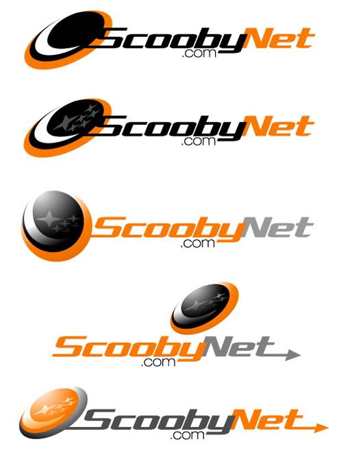
i even threw in the dodgy arrow at the end too
08 November 2006, 05:50 PM
#51
Scooby Regular

Join Date: May 2004
Location: in motoring nirvana.....
Posts: 2,443
Likes: 0
Received 0 Likes
on
0 Posts
Great designs Kev - but how about changing the Black to WR Blue and the Orange and the Stars to Gold - just to see what it looks like - representative of Subaru colours
08 November 2006, 05:56 PM
#52
Scooby Regular
Join Date: Aug 2005
Location: northamptonshire
Posts: 132
Likes: 0
Received 0 Likes
on
0 Posts
Originally Posted by flat4
just had a play around with my favourites and added some stars as they seem a popular request i even threw in the dodgy arrow at the end too
i even threw in the dodgy arrow at the end too Gets my vote

 08 November 2006, 07:33 PM
#55
Scooby Regular
iTrader: (5)
Join Date: Jan 2004
Location: Bedfordshire
Posts: 8,948
Likes: 0
Received 0 Likes
on
0 Posts
Spot on mate.
Originally Posted by Hoppy
Why?
We have a saying in magazine publishing - when the editor wants a new logo, it's time for a new editor.
New logos are very difficult to get right, especially when they are part of a change in direction. They are very often associated with desperation and impending disaster. Hopefully that is not the case here
So I ask again: why?
But it is possible to spruce things up a bit, while keeping the key elements strong and recognisable, eg ScoobyNet IS orange and white. The Coke logo has been tweaked many times over the decades, but still looks familiar and contemporary. Most of the great brand logos are the same.
Just make sure the new logo embraces Christian, Jewish and, above all, Muslim symbols
Richard.


 09 November 2006, 12:41 PM
#60
ok.. we're going well. Nice work guys.
I have to tell you that flat4 is slightly in the lead currently! Very impressed.
Time's running out though.. there must be more of you lot out there with all that artistic flair! Flat4.. keep going, if you can bare to look at orange any longer, I think you could be onto something!
I have to tell you that flat4 is slightly in the lead currently! Very impressed.
Time's running out though.. there must be more of you lot out there with all that artistic flair! Flat4.. keep going, if you can bare to look at orange any longer, I think you could be onto something!